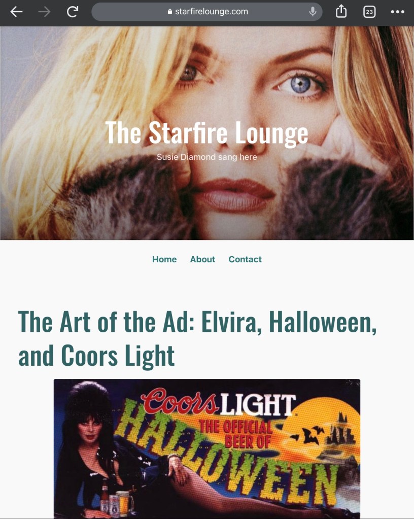
It’s two and a half years since I launched The Starfire Lounge and for all of that time the extravagantly serifed Cherry Wash has served as the title font. Just like everything else in the basic site design, I didn’t put much thought into the font, just picking one of the first I saw from the drop-down that grabbed my eye. When I launched the site I made a point to do it quickly—don’t worry about any extraneous stuff, just slap something together and start writing.

Well, two and a half years on, it’s finally time to change that font. Cherry Wash was a little more ornate than my usual taste in fonts, so now I’ve gone with something cleaner and more modern called Oswald. Hopefully it’ll help make the post titles pop a little more, plus be easier to read on smartphones or tablets. I so rarely do any house cleaning around here that I feel a major sense of accomplishment just for doing this one tiny thing.

I like the font. Most importantly though, it looks sharp suspended in air in front of Michelle Pfeiffer’s ethereal visage in the banner photo.
So, onward and upward and all that jazz, right?